Coursera - Character Design for Video Games, week 1
I’ve started CalArts’ Character Design for Video Games and here are my course notes for week 1. I’m happy to have Fran Krause back as instructor (who presented the introductory course), as he’s very clear and understandable. And quite funny.
This course is structured a little differently. The majority of the class (Weeks 2, 3, and 4) are built around studio visits with three established character designers. In these “master classes” we’ll have the opportunity to observe these artists at work and talk about their process in conceptualizing and resolving their designs. We’ll also be introduced to the foundational concepts of good character design. The idea behind this course is to practice key concepts and techniques learned each week on my own characters.
I can’t wait - I love to doodle!
Week 1
We’re started off with a prompt: who is your favourite character from a video game, and why? Here’s my answer:
Harrier “Harry” DuBois from Disco Elysium. He is an immensely deep character from an equally deep game (with lore going back 6000 years!). He is very human, wakes up with amnesia in the opening chapter, and learns about himself as the game progresses.
The game’s art style is phenomenal - beautiful painterly watercolour graphics. It gives Harry and the world around him an equal sense of beauty and imperfection, and also a fragility which can be washed away with water at any moment.
A good character design communicates things to your players. It might tell you you’re about to embark on a fun, cartoony quest to save a princess, or a dark, post-apocalyptic mission with outfits made out of scavenged materials.
Here are some concepts when we compare designs:
- Density: This is the amount of visible elements on each character. The more dense your design, the more you have to work with to tell the audience about your character. The player will probably be noticing the effects of all of the elements rather than any one specific element in a denser design. If you want an element to stand out in a dense design, it will have to visually stand out.
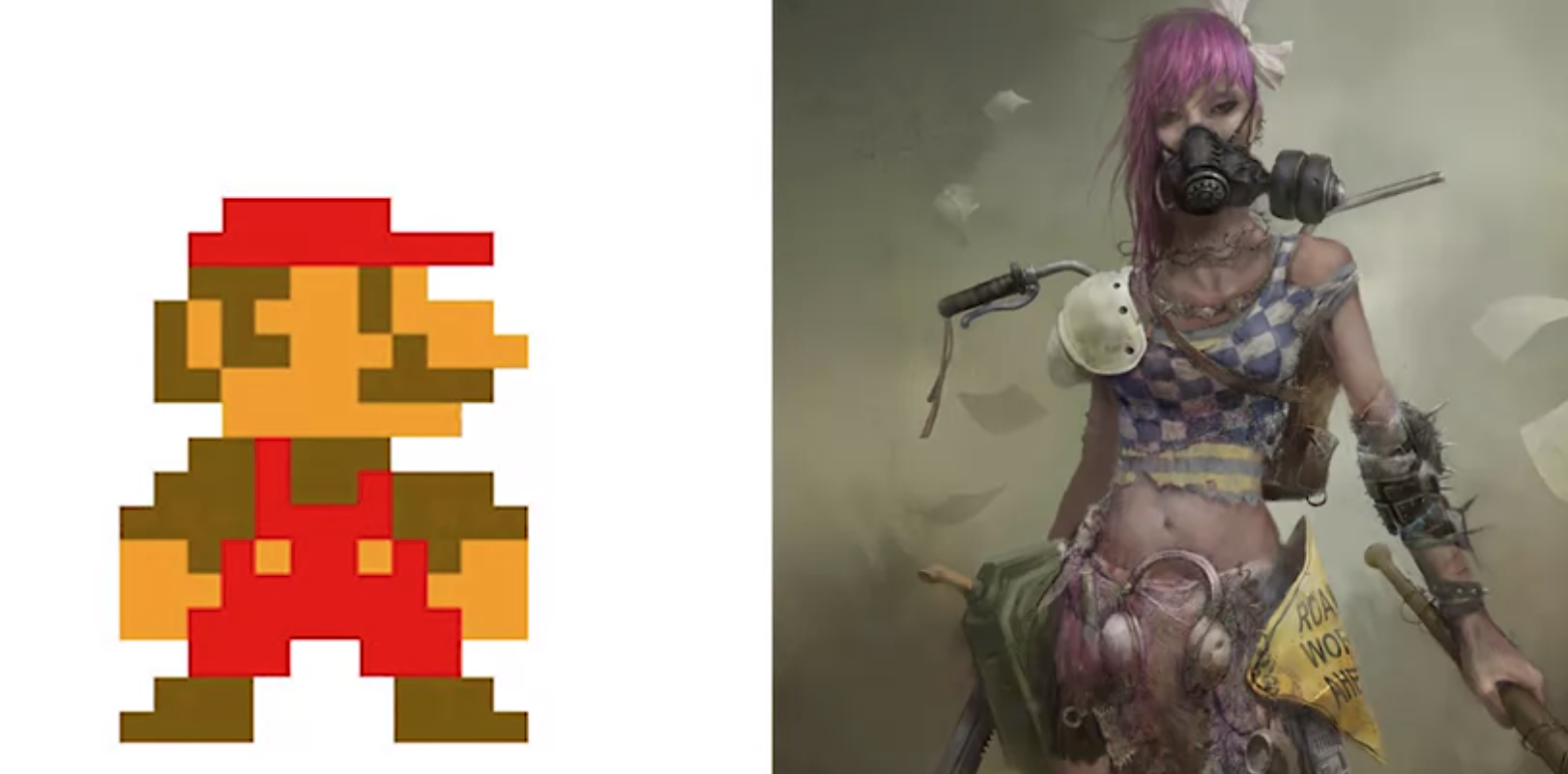
- Mood: Mario seems cartoony (big head, bright colours) and friendly. The Wasteland 2 character seems more serious (somber, muddy colours) and threatening (realism lent through more realistic proportions, and pose). So, colour, pose, props, proportions.
- Story: Who is a character, and what’s their story? Mario is so simply designed, and has no backstory AFAIK, and you’re playing one simple story line from beginning to end. Conversely, the other character is unhappy with armour made from scavenged parts, have been in battle and have scrapes to prove it. They are primarily a fighter, with weapons in each hand. The second character is obviously from a game where story is more important than that of Mario.
- Proportion: big heads (Mario), only heads (Angry Birds). Various things are at play, and we’ll mention two: character size, and character purpose. The big, and you don’t see the rest of the game; too small, and you don’t know what’s going on in the game. If your character is acrobatic (like in Trine), they might need to be more proportional, but then then you might not see their face that well to see expressions (if you give a proportional character a big face, it might look weird). Angry Birds are just heads, because they are just projectiles, and we want to see their angry expressions. In Trine’s case, we don’t see the character’s face during gameplay, hence we have cut-scenes for this purpose.
Assignment
In this assignment I’d like you to try designing a character that you’d consider using in a game, trying three different approaches. The goal here is to start thinking about how and why your drawings work (or don’t work) and to get used to trying different approaches to your designs.
You can draw them with pencil and paper, or digitally paint them, or make a collage, or any method you’d like. The technique is less important than the design itself.
In each variation, try to work with one of the concepts we’ve covered in this week’s lesson:
- Density
- Mood and Story
- Proportion
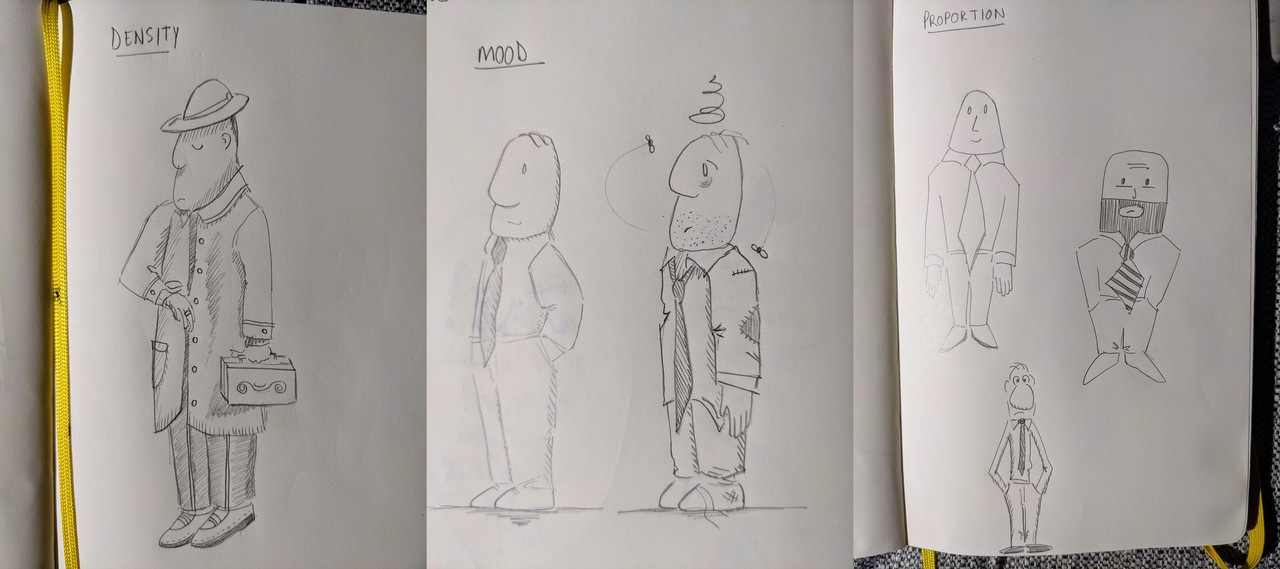
The character sketches I made are here:
To accompany your drawings, please also include a short description of your character: name, background, motivations and story—whatever information you think would be useful to help support your design choices. Also, please explain the different approaches you’re attempting in each drawing - for instance, “In the third drawing, I’m adjusting my proportions to try to make my character less cute.” or “In the second drawing, I’m trying to add some elements to my design to help communicate a little more of my character’s story.”
The character’s name is Nigel. He is from a small town and moved to the city when he left school. He’s been trying to make it big ever since in a world which is a constant rat race where everyone will step on you to get ahead.
In the Mood drawing, I’m trying to convey two moods: the left-hand Nigel being upbeat, chin up, shoulders back, and ready to take on the world. This is the positive character that will make you smile in the face of adversity. The right-hand Nigel is a downtrodden insomniac, and can’t get ahead. His clothes are scruffy, his hair is out of place, and he is a bit behind on the personal hygiene - his water and electricity got cut off because last month’s utilities cheque bounced.
In the Proportions drawing, I’m trying to make Nigel oddly-shaped for novelty effect (left), stout and hardy with a beard to seem tougher (right), or lanky and a bit of a pushover (bottom).
In the Density drawing, I’m adding much more detail. Nigel has an expensive watch and a bespoke attache case. He’s wearing a pinstripe suit, and a heavy overcoat. He’s fashionable and wearing a fedora. His shoes are the finest English shoes money can buy. Clearly this Nigel is successful. His attache case is a bit tiny, so maybe he’s carrying an antique artifact instead.
Conclusion
I’m excited about the rest of this course. It’s well put together, with good information, bullet points, structure, and the instructor speaks very clearly. I’ve learned about the variation of density, mood, story, and proportion of a character, which are the foundational concepts of character design.
I’ve also read the chapter on character design in the Fundamentals book, and it talks more about other aspects, like leaving your character “blank” so you can project more of yourself onto it (e.g. Mario, or Lara Croft), meaning that these characters are not that detailed, and doesn’t really have a back story. It talks about character dimensionality, e.g. LOR Orcs are either hateful or fearful, but Frodo experiences a wide range of emotions. Then you also have characters like Gordon Freeman who you only ever see on the box art, but otherwise YOU are Gordon. You never see him in a mirror, you never hear him speak.